

Vincenzo Latronico's 'Perfection' is pure satisfaction. But is it any good?
On the nature of catharsis in contemporary literature. Also: Pantone.


I finally got around to reading Vincenzo Latronico’s Perfection, the novella that just about everyone is talking about this year. Like with Honor Levy’s My First Book last year, I am again very late to the party (the translation came out in what, February?), but perhaps I come bearing enough end-of-party coke in my jacket pocket to convince some of you to stick around for a chat before going to your coats. Say, can I do a bump off your tit?
Perfection is a Juvenalian satire aimed at the lifestyles of “digital nomad” yuccies, neocolonial parasites that burrow into places like Lisbon, Mexico City, East Berlin or the like, where they can live frugally as they exacerbate gentrification and displace the original residents. I found it immensely cathartic. Why? Because I myself have known such tiresome yuccies. I live in Montreal, where the gravitational pull of Ubisoft’s offices there have spawned a hive of obnoxious migratory anglophone tech pest. I’ve even seen people I’ve considered friends here in Montreal get infected by this disease and start moving to places like Portugal to go exploit them in turn.
More than anything, Perfection is astute, nearly ethnographical in its assessments. But still it left me wondering: what’s the point of all this? Is it simply enough for a work to be incisive? I don’t know about that. Perfection is of course an adaptation of the premise of George Perec’s Things, merely updated to reflect our current reality—both present themselves in a sort of inventory of their protagonists’ lives, a structure that in Perec wound up being avant-garde, but, exactly replicated sixty years later, becomes pastiche. Even the style of the prose is more or less identical to Perec’s in its matter-of-fact, unadorned, inventory-obsessed style (in translation in English, anyway, or when compared to Perec’s original French—I can gather as much from my limited French, though I lack the comprehension of Italian to say for certain on Latronico’s original).
But what does it add to Perec’s original outside of simply translating the concept to the present day? Because the thing is (heh heh) that Things is still relevant, you just have to do the process of substitution in your head—is it really even necessary to just produce that substitution as its own work of literature? While Latronico’s incisions cut deep, the bones he exposes underneath still constitute the same skeleton Perec already revealed. Things is timeless. Perfection is, by its very nature, timely. Which will people still be reading in one hundred years? Perfection will certainly be a must-read for anyone whose interest is, in particular, our current era—to those people, it will provide an incredible window into the past. But it will not, it cannot, be remembered as a “great” work of literature that stands the test of time, because it has already failed the test of time by the nature of its very premise. It constitutes a literary subsidiary of a canonical work.
I think a significant portion of Perfection’s current esteem comes from the fact that we live in a particularly frustrated era, one marked by impotence as most of us in the west watch our standards of living gradually decline and those in the periphery continue to be pulverized. Everything annoys us because everything sucks, every archetype becomes an effigy,1 everything we can form into a coherent shape or outline of a target is just another thing for us to throw darts at. Make no mistake: the form of yuccie that Latronico is describing is, indeed, a loathsome flea that sucks the blood from the places it infests, but would the instinct to scratch—the catharsis in watching the object of our ire be crucified—be so satisfying were it not for the pressing need for release elsewhere, for the alleviation of our collective station? I really don’t think so. And I further don’t think that such simple catharsis is all that artistically interesting when we ask ourselves to step back and assess the thing beyond that gratifying impulse. In spite of this seemingly animal gratification, it is unfrenzied, we become but a cruel and removed Apollonian eyeball.
Ultimately, Perec is more worth the price of admission. Far more original (obviously) and ultimately just as astute in its skewering of bourgeois/petite bourgeois proclivities. Godard’s Weekend also comes to mind. As an aside, Latronico is also a translator of Orwell, who I don’t care for—in particular, he translated Animal Farm, which I consider one of the worst “canonized” novels in the English language. But I will likely write a lengthier take-down of Orwell another time.
Up next: a more topical… topic. But first! A subscriber break.
Or read last year’s piece on Honor Levy:
Honor Levy at the end of the wor(l)d

Burroughs was right, the word IS a virus, because reading Honor Levy's stupid fucking book, the nauseatingly-titled My First Book, gave me something akin to Long COVID.
So anyways: the Pantone debacle
The Fitzcaraldo Editions to which Perfection belongs are notables for their utilization of International Klein Blue, a bold colour created by my personal favourite performance and conceptual artist, the French madman and on-the-sly satirist, Yves Klein. The only other colour on these covers is “white,” a colour which Pantone chose as their “colour of the year” for 2026. You might think this is innocuous, but apparently this is some full-on Klan shit. Tons of people are freaking out. Here’s one:
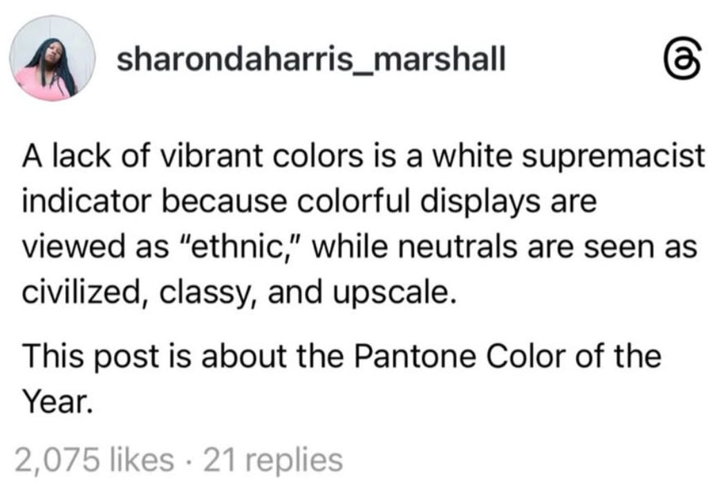
A lack of vibrant colours is white supremacist! Somebody please explain that to thiese Ethiopians, because I don’t think they got the memo:

I would also note that what is “civilized,” “classy,” or “upscale” is also often marked by not just white but black. A black suit is generally seen as more formal than a white suit. Black shoes. Black dresses. The most elegant cars are usually black, in fact the American Presidential car—the “First Car”—is always black. Monochromatic colour schemes—not just “white”—tend to be seen as fancy. This sort of reductionism is very silly. Among countless other posts I saw, this lady Alysia Cole went so far as to claim this was linked to the “rise of fascism”:
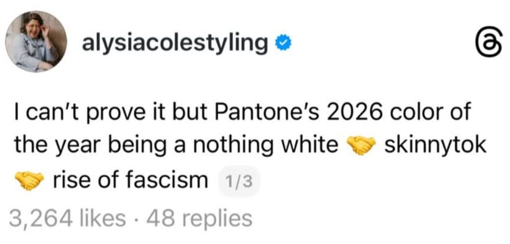
…which is funny, because I found out Cole is famous for designing plus-size wedding dresses, and wedding dresses traditionally look like this:

In fact these are all photos of Alysia Cole herself! I guess if Cole’s claims are meant to be taken at face value then these are dresses for plus-sized ladies looking to get married in the Führerbunker.
The truth is, this is irrelevant. The meanings of colours are not fixed, and seeing this decision as being somehow “fascist” or “racist” is absurd. Likewise, last year’s “mocha mousse” was not an expression of racial anything in spite of it being an actual colour that skin can actually be, it was if anything merely a paean to shitty web design trends.
Thing is though, I don’t even care if it does turn out to have been an unambiguously racist move. The CEO of Pantone could come out and prove me wrong tomorrow and say “hey what’s up everybody I actually hate brown people” and what difference does it make? Whether Pantone is racist or anti-racist makes no material difference for the suffering of the marginal, who are still condemned to suffer in either scenario—“racist” Pantone, “anti-racist” Pantone—under the same system Pantone profits from. Pantone has worked with countless evil institutions, it’s even worked with the Kingdom of Saudi Arabia as it slaughters Yemenis. Gain some perspective, people.
Or read more of our thoughts on culture warriors:
An infection of the common web: an obituary for the culture war as we knew it

The Obama years gave rise to a cultural reflexive (born out of people habitually defending the imperialist president against racist dogwhistles both real and made up) that grew and grew before erupting around the 2016 election of Donald Trump. Fueled by anger at the reactionary Trump campaign and later administration, as well as the proliferation of little-understood critical theory concepts diluted into buzzwords on social media sites (beginning with Tumblr and then expanding out to other platforms), this cultural reaction began with “good intentions” but led to an era of paranoia, overreaction, and censoriousness that very quickly became exhausting. This was far from new, though the adherents of so-called online “social justice” may have believed otherwise—similar reactions to Reaganism coalesced in the 80s and 90s into “political correctness,” which itself was shrugged into the void with the rise of “third way” politics embraced by liberals in the 90s.
See: Freddie deBoer’s piece on “Type of Guy” anxiety.
A good review and discussion on the book. I read it earlier this year and enjoyed it for what it was. I thought the ending, too, was particularly well executed. As a commentary, it was sharp, and as a novel, well-written, although anything of that length sans dialogue become challenging at some point.
Are you still planning on writing the Orwell review?